9 Ocak 2018 Salı

The Prejury and the Final Jury (17 Voids)

The Materials:

Opaque Surface: Cardboard, Balsa sheet
Translucent Surface: Wire mesh, Translucent acetate paper
Stick Materails: Wooden sticks, Metal sticks

We have been working for forming voids for a while. Firstly we made 3 then 5 and finally we reached 17 voids in total system. Making that amount of voids embedded in the desgin system was the both purpose and challange of the assignment.

For arrangement, I decided to form a path that air-flow can follow and, thus, an interrelated system is born. The starting point was the fornation of a group that will be repeated in the system. After that I repeated them in way that the path is not interrupted or blocked. Thus, the design that I will be presenting to jury for prejury is finalized.

With the critics that I got in both jury and critic sessions, I revised my work. The foundation of the work is preserved and it has developped in terms of organizational complexity and the flow between interrelated voids.

The project and posters of prejury work


The project and posters of final jury work


The Midterm Jury (Double-Sided Relief)

The Material:

1.White cardboard

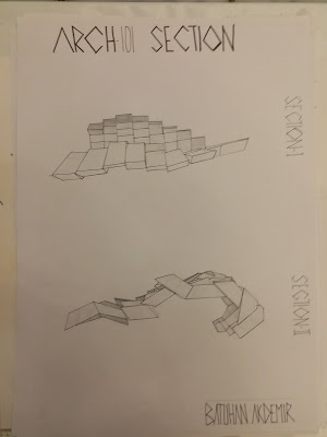
For midterm jury we were respoansible from creating double-sided relief that shows the concept of different design principles which leads us that creation of two different relief by using elements -herein rectangular prisms- formed from cardboard. The principles that we can apply for this work were the things that we leant so far: hierarchy, dominance, rhythm, repetition-variation... This project's process covered a time period which is nearly a month.
At the end we had our very first jury.

In my project a decided to apply repetition for one side and contrast for the other side. I firstly create a group and repeated it for three times with some gaps, after that those gaps are filled in a way that the relief's visual effect is feasible. However, until I got the understanding of this project I've lost time, but those mistakes helped me for made the successful one.


8 Ocak 2018 Pazartesi

Assignment #7-Process Towards the Final

The Materials:

Opaque Surface: Cardboard, Balsa sheet
Translucent Surface: Wire mesh, Translucent acetate paper
Stick Materails: Wooden sticks, Metal sticks

In this assignment, we were firstly intoduced to concept of void and formation of that. Actually, from the understanding of formation of void, we are also introduced to 3D design concepts. I saw that the concepts that we learnt in 2D design are also valid in this process.

Firslty, we were responsible from formation of 3 related voids by using one material option for opaque surface , one for translucent surface and one as the stick element. Herein, we faced with the concept of relation; there were many ways of relate two or more volumes and we usually worked with the undersanding of a path that created for an imaginary air-flow to follow it. With keeping minde this understanding, I shaped the organization. Then the number of voids that expected are augmented; firstly it became 5 then 7 and finally we reached 17 which is also expected number for the final project.

The first step, related 3 voids


The second step, with 5 voids 

The revised second steo, again with 5 voids


7 Aralık 2017 Perşembe

Assignment #7 (The Voids in Faculty)

The Voids in Faculty

We were expected to walk around the faculty and take pictures of interrelated voids that we faced. The sketches and drawings were also expected in this assignment. The explanation of the relation types of the voids were also required to be stated. All these things, photos/sketches/drawing and their explanations should be dne on A4 size papers.


Assignment#1 (Abstract Mapping)

The Materials:

1.A3 Cardboard (White)
2.Acetate Pen (Tip with M)
3.A3 Translucent Paper (Not heavier than 130g)

We were expected to go around the faculty and take pictures that gives the tones of grey in monochromic effect best. After that we had to express those tones by drawing lines with different thicknesses and longevities. Herein, the abstraction part was crucial, eliminating things from the picture was a job that has to be done very carefully. Otherwise, the picture might lose parts that it has to contain to fulfill the criteria and architectural concept.

Assignment #2 (Repetation and Variation)

The Materials:

1. White, grey and black cardboard depending on the step.

This assignment included 4 steps in total.

Repetation and Variation-4 (Any number of shapes can be used)

Repetation and Variation-3 (7 rectangles, 13 triangles, 5 parallelograms, 5 circles)

Repetation and Variation-2 (5 rectangles, 11 triangles, 7 paralellograms)

Repetation and Variation-1 (3 shapes from the previous assignment)

In this assignment, main aim was foming group/s from the given materials and by using different techniques such as variation, repetation and mirroring, forming a design rule that can be applied throughout all the surface. Herein, background had to have role as an design element.


Assignment #3 (Dominance and Contrast)

The Materials:

1. Paper band width of 1mm
2. Black Cardboard (29cm, 41cm)

In this project, we were responsible from representation of principles dominance and contrast by using white paper band spanning edge to edge. Herein, the contrast was directly created owing to color distinction between cardboard and paper band. The dominance is created in my work by foming a main shape that attracts the attention first.

Assignment #5 (Rhythm)

The Materials:

1. Grey Cardboard (27.5, 39.5cm)
2.Two Sets of Letters (Black/White)

We were responsible from crating a rhythm throughtout surface specified by dimesions by using letters in white and grey. The limitation here was picking up only 5 letters from the alphabet. Herein, the significance of choice behind thouse letters was basicly the harmony of the group or the design created by them. All the techniques used before such as variation, mirroring and rotation was expected to be used here.

5 Kasım 2017 Pazar

Assignment #4 (Hierarchy)

The Materials:

1. Black carboard as the background
2. Craft paper
3. Newspaper

Into this assignment, we were responsible from designing a relief that can express the existence of the concept of hierarchy. We were able to use cylindrical shapes that we cut from both craft paper and newspapers. Adjusting both types and sizes of the cylinders made the design field have the characteristics of relief which by carvetion creating the feeling of 3D designed field. For hierarchy, we had to have a dominant group that also has a ranking of its elements in the design field.


The first try-out that we made in class:


The finalized work

The Principles of Design

Rhythm

Rhythm is another fundemental of design. It can be defined as organization of elements that makes the eyes of audience follow the elements seen, basicly. Herein, the use of space has a crucial role because its effect becomes more than just the figure-ground relationship in rhythm. There are many rhythmic organizations made all over the campus. I picked some basic ones such as the trees that planted with same gaps. The other one was the colons placed in a way that created curvilinear path in the road. The last and the best one was the emergency stairs. They were placed so perfectly that the eye feels a requirement to follow it till the end.


The Principles of Design

Hierarchy

Hierarchy can be defined as dominating group of elements which also have ranking of themselves in the group. The visual interpretation of this can be seen as the existence of elements which seem more significant for the design field. Herein, the domination concept is applied in more broad comprehension and application for the design field. For examplifying the hierarchy, I pictured the stairs which is diveded in its field by the sloped region. Owing to  the parallax view of the stairs, the sizes of sloped regions are differentiated and thus created the ranking of the dominating group in the picture. Although the other example lacks of the ranking of elements that created hierarchy, the expression of hierarchy can be felt easiy owing to the spaces created in the wall.
the spaces
the stairs mentioned

The Principles of Design

Dominance

Dominance in design field refers the element or group of elements that gain the attention of audience firstly. This can be achieved by using size, color, shape in design. For example, in the picture it's seen that the bolded windows attract the attention first on it. The audience firstly recognize those parts in the picture and after that they seacrh for the pieces that make up the whole. This is the foundation and basic explanation of the concept of contrast. Another example can be seen in the cones placed. The cone in the middle dominates the other by its size because sometimes being bigger is just enough to draw attetion in design field.


The bolded windows attract the attention firstly.

The cone in the middle cdominates the others by its size

The Principles of Design

Constrast

The constrast in design can be interpreted as the element that interferes the harmony that created throughout the desing. There are many ways of creating contrast in design but the mostly-used ones are color, size, texture and laying direction of the elements. In the first picture, it's seen that the white windows are the elements that interfere the harmony created by using of black as the paint for other windows. In the second picture, the color of the tree makes it different from the rest in the picture.
 

The Principles of Design

Variation 
Variation is firstly used with repetetion in our assigments to enrich the design itself. Scaling was the first and probably most used technique to create varition in our designs. While it's not that complex to use, with a good organizaitonal plan the advanced works can be produced. Herein, I picked up to photography the air canals placed in several points in the campus. It's a basic example of scaling. As it's seen in the picture, the bigger square is made up from smaller ones.

The Principles of Design

Repetition
Repetition  is one of the principles of design and also it's seen as a foundation or cofactor of many other principles such as varition and rhtym. Even though it's mostly mixed up wih rhytm, repetetion has more easy to apply and understand. It can be basicly explained as repeting of an element or a group. Herein, the use of space does not matter unlike it does in rhytm. Therefore, it's usually used with other principles to make the design enriched. I decided to put a rudimental example of the concept of repetition because to get an clear idea about it can be easily achieved by giving clear ideas. Therefore I put the repetition of a grouped stones which can also seemed as a pattern herein. Another one was the columns seen both in the ceiling and the façade.